Showing posts with label Map Projection. Show all posts

Sunday, November 22, 2020

Python | Tutorial: Blue and Black Marble Aurora Figure using Background images and Day/Night Delimiter

Introduction

One of the strengths of Python, and specifically Cartopy, is that it's pretty easy to combine many different datasets with varying geographic coordinates onto a single map.  In this tutorial, I'll combine background "Blue and Black" marble images from NASA with the forecast aurora data from the Space Weather Prediction Center (SWPC: https://www.swpc.noaa.gov/), and simulated cloud cover from the GFS to produce an aurora forecast map.  Now, since one of my main goals for this blog is not to simply regurgitate what already exists, if you are just looking to plot the aurora forecast, there is an excellent example (which I'll be building off of in this tutorial) of how to so in the Cartopy gallery: here.
This is a somewhat advanced tutorial, so I won't be focusing on trying to explain a lot of the plotting minutia or reasoning.  If you're just starting out it is recommended that you check out some of my beginner tutorials first: Introduction to Cartopy, and my post on how to read in NetCDF data.
In this tutorial you will learn how to:
  • Load background images into Cartopy
  • Use the Cartopy "Nightshade" feature to blend the NASA blue and black marble images
  • Maskout shapefile geometries
  • Load the aurora forecast from the SWPC using Numpy "loadtxt"
  • Create a custom colormap using matplotlib "LinearSegmentedColorMap"
  • Use the NearsidePerspective projection from Cartopy
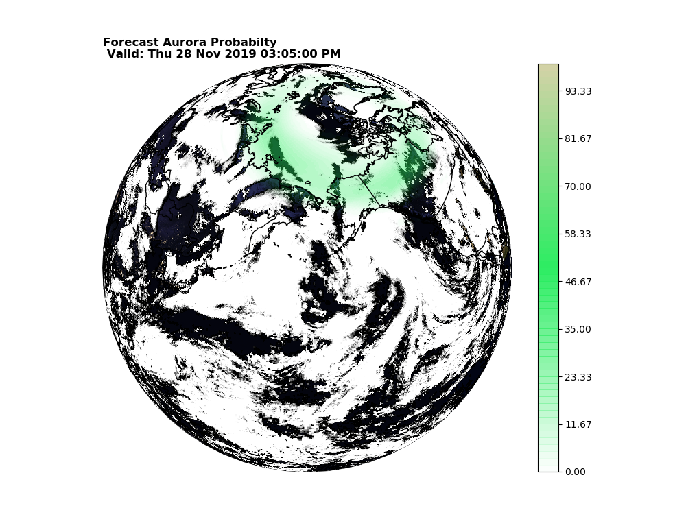
The end result of the tutorial will be an image that looks similar to this, but will be different depending on the time of day, auroral activity, and cloud cover:

Final Product: Forecast Aurora Probability and simulated GFS clouds valid UTC time.


Loading the background images

The first step is to download the "Blue Marble" and "Black Marble" background images to load into the dataset.  These are pretty easy to grab, I will simply provide links to the geotiff 0.1 degree versions for each image.  Load these into a folder where you can access them using a Python script.
If these don't work you can try the parent sites: Blue Marble here, and Black Marble here.

Now that you have the data, it's time to load it into Python.  Before that however, the required packages for the entire tutorial need to be imported:

try:
    from urllib2 import urlopen
except ImportError:
    from urllib.request import urlopen

from io import StringIO

import numpy as np
from datetime import datetime, timedelta
import cartopy.crs as ccrs
from cartopy import feature as cfeature
import matplotlib.pyplot as plt
from matplotlib.colors import LinearSegmentedColormap 
from cartopy.feature.nightshade import Nightshade
from matplotlib.path import Path
from cartopy.mpl.patch import geos_to_path
import netCDF4 as NC

Note the"try" statement is used to make the script compatible with both Python 2.7 and Python 3 urllib syntax.  Now, once the data is imported, I'm going to define a common function to load the "Marble" images, since they have identical lat/lon boundaries.

def load_basemap(map_path):
    img=plt.imread(map_path)
    img_proj = ccrs.PlateCarree()
    img_extent = (-180, 180, -90, 90)
    return img, img_proj,img_extent

You should be able to see that the above function is really straightforward.  The image is first loaded into an array using "imread" from matplotlib, and then the image extent is set to span the entire glob (which is obvious from looking at the image), and then the image projection information for Cartopy is set to PlateCarree, since we are working in lat/lon coordinate space.  To investigate a little further, we can call this function and look at the shape of the image array.
Assuming the image is in the same folder as your script...

map_path='RenderData.tif'
bm_img,bm_proj,bm_extent=load_basemap(map_path)
print(np.shape(bm_img))

returns: (1800, 3600, 3)

Notice that the array returned has 3 dimensions despite the fact that it is a 2D image: the 3rd column is where the individual red/green/blue information for the image is stored, where as the first 2 columns correspond to the y and x pixels.  To demonstrate this, I'll plot each channel separately without geographic information.

plt.figure(figsize=(8,14))
ax=plt.subplot(311)
plt.pcolormesh(bm_img[:,:,0],cmap='Reds')
ax=plt.subplot(312)
plt.pcolormesh(bm_img[:,:,1],cmap='Greens')
ax=plt.subplot(313)
plt.pcolormesh(bm_img[:,:,2],cmap='Blues')
plt.show()

This produces the following image:
RGB channels for the Blue Marble image (Yikes! It's upside down!)
Note that where all three channels are saturated, the combined RGB image will be white (e.g., Antarctica), where as where all three channels are faded, the RGB image will appear back (e.g., the Oceans).  Also notice how the image is upside down, this will be addressed in the next part.

The question, is how can we plot the combined RGB image from the 3 dimensional array.  Instead of using the "pcolormesh" or the "contourf" functions, the "imshow" function is used.  this function, is versitile and naturally takes a 3D array assuming the 3rd axis (if there is one) is the RGB channel.  It also, takes the extent argument, which defines the image corners, without needed corresponding coordinate arrays.

    plt.figure(figsize=(11,8))
    ax=plt.subplot(111,projection=ccrs.PlateCarree())
    ax.imshow(bm_img,extent=bm_extent,transform=bm_proj,origin='upper')
    plt.show()

This results in the following image:

Blue Marble
I won't go into detail on how to load the black marble, however, I will provide the code used to load both images as they are read into the final product.


bm_img,bm_proj,bm_extent=load_basemap('RenderData.tif')
nt_img,nt_proj,nt_extent=load_basemap('BlackMarble_2016_01deg_geo.tif')

Blend Images using the Day/Night Delimiter

This next section is the crux of the whole tutorial: Basically, I'll explain how to use Cartopy Nightshade (Note: requires version 0.17 or higher) to mask out the day time blue marble and show the night time black marble image.  For this, I'll use the matplotlib "Path" function to draw a polygon "path" connecting the coordinate information associated with the Nightshade function.

The Nightshade function is a neat function that allows you to draw the day/night delimiter on a glob for a given datetime object.  In the full example, the datetime object will be defined by the aurora forecast, but for demonstration of Nightshade, the datetime.now() object will be used.

For a simple demonstration, simply copying the code to generate the blue marble image, with only a couple of added lines, provided you are following the tutorial with the package imports written as above:


plt.figure(figsize=(11,8))
ax=plt.subplot(111,projection=ccrs.PlateCarree())
ax.imshow(bm_img,extent=bm_extent,transform=bm_proj,origin='upper')
ax.add_feature(Nightshade(datetime.utcnow()),zorder=2,alpha=0.8,color='r')
plt.title(datetime.utcnow().strftime('%c'))
plt.show()

This will essentially mask out the "night sky" over the blue marble image, it's that simple!
Night masked out.

Now the goal here is simple: replace the "red" masked out section with the black marble image.  To do that, I'll first define a function to clip regions within the shapefile polygon.

The first step is to define the Nightshade "shape" from the Nightshade function:

nshade=Nightshade(datetime.utcnow())
transform=nshade.crs

Now we have both the nightshade shape, and the nightshade coordinate reference system, which is needed to ensure the projection transform is performed correctly.  From the shape, we grab the geometries (i.e., the polygons, or in this case ... polygon; singular).

geoms=list(nshade.geometries())

Here is the tricky part: because the Nightshade coordinate reference system is NOT Plate Carree (it's a rotated pole projection for those interested), it's important that the transform is done correctly.  If you assume the transform is Plate Carree you will end up with a mask that is wrong.  However, the matplotlib path function requires that the transform is a matplotlib transform, and not a cartopy crs object.  So, to do this conversion, I will define a "dummy" transform when defining my Caropy subplot that equals the crs from the nightshade object.

fig = plt.figure(figsize=(10, 8))
ax = fig.add_subplot(1, 1, 1, projection=ccrs.PlateCarree(),transform=nshade.crs)

Now, we have a defined figure, and a matplotlib transform that matchs the nightshade object, we're ready to mask.  First we plot the blue and black marble images on the same subplot, and then use the geos_to_path and Path functions imported at the top of the script:

plt.figure(figsize=(11,8))
ax=plt.subplot(111,projection=ccrs.PlateCarree(),transform=nshade.crs)
im0=ax.imshow(bm_img,extent=bm_extent,transform=bm_proj,origin='upper',zorder=1) 
im1=ax.imshow(nt_img,extent=nt_extent,transform=nt_proj,origin='upper',zorder=2)
path = Path.make_compound_path(*geos_to_path(geoms))
im1.set_clip_path(path, transform=ax.get_transform())
plt.title(datetime.utcnow().strftime('%c'))
plt.show()

And the blended image is complete,note that the subplot transform is used in the set_clip_to_path function:

Blended image based on current datetime.

Now, it's time to plot the aurora forecast.

Loading and Plotting the Aurora Forecast

This section will mostly be a reproduction of the code demonstrated here, with some minor differences.  Esentially, Numpy loadtxt is used to load the ascii data from the SWPC into a 2 dimensional array and the array is plotted on the map.  The first step is to define a cool looking aurora color bar.  This a a direct reproduction from the Cartopy example because I think they did a nice job with the color scales.

def aurora_cmap():
    """Return a colormap with aurora like colors"""
    stops = {'red': [(0.00, 0.1725, 0.1725),
                     (0.50, 0.1725, 0.1725),
                     (1.00, 0.8353, 0.8353)],

             'green': [(0.00, 0.9294, 0.9294),
                       (0.50, 0.9294, 0.9294),
                       (1.00, 0.8235, 0.8235)],

             'blue': [(0.00, 0.3843, 0.3843),
                      (0.50, 0.3843, 0.3843),
                      (1.00, 0.6549, 0.6549)],

             'alpha': [(0.00, 0.0, 0.0),
                       (0.70, 1.0, 1.0),
                       (1.00, 1.0, 1.0)]}

    return LinearSegmentedColormap('aurora', stops)

Basically, a dictionary with 0-1 values for red (r), green (g), blue (b), and transparancy (alpha) is passed to the LinearSegmentedColormap function which defines a color map that basically linearly interpolates between each of the 9 "stops" defined by the user.

Now, that the colormap is defined, you can pull the aurora data from the SWPC and load it into an array:

    # To plot the current forecast instead, uncomment the following line
    url = 'http://services.swpc.noaa.gov/text/aurora-nowcast-map.txt'

    response_text = StringIO(urlopen(url).read().decode('utf-8'))
    aurora_prob = np.loadtxt(response_text)
    # Read forecast date and time
    response_text.seek(0)
    for line in response_text:
        if line.startswith('Product Valid At:', 2):
            dt = datetime.strptime(line[-17:-1], '%Y-%m-%d %H:%M')

Now, again this code is largely copied from the Cartopy example, but essentially you're reading the text information from the URL, first into the Numpy loadtxt function, which is a natural fit for this data, since the function, by default, assumes "#" is a comment, and "spaces" are delimiters, so in this instance, no additional arguments are required for loadtxt.  Then, the datetime associated with forecast is read into a datetime object.

Since it is known that the lat/lon data spans -90 to 90 and -180 to 180, we define lat/lon arrays based on the shape of the aurora data:


lons=np.linspace(-180,180,np.shape(aurora_prob)[1])
lats=np.linspace(-90,90,np.shape(aurora_prob)[0])

Finally, combining everything together to product the "cloud-free" aurora forecast:


plt.figure(figsize=(11,8))
ax=plt.subplot(111,projection=ccrs.PlateCarree(),transform=nshade.crs)
im0=ax.imshow(bm_img,extent=bm_extent,transform=bm_proj,origin='upper',zorder=1)
im1=ax.imshow(nt_img,extent=nt_extent,transform=nt_proj,origin='upper',zorder=2)
path = Path.make_compound_path(*geos_to_path(geoms))
im1.set_clip_path(path,transform=ax.get_transform())   
Z=ax.contourf(lons,lats,np.ma.masked_less(aurora_prob,1), levels=np.linspace(0,100,61), transform=ccrs.PlateCarree(),     zorder=5,cmap=aurora_cmap(),antialiased=True)
plt.title(datetime.utcnow().strftime('%c'))
plt.show()

Which gives you the following image:

Aurora Forecast with Plate Carree Projection

Finally, replacing the PlateCarree map projection with the NearsidePerspective projection, we get something a little bit closer to the final image:


fig = plt.figure(figsize=[10, 8])
ax = plt.axes(projection=ccrs.NearsidePerspective(-170, 45),transform=nshade.crs)
im0=ax.imshow(bm_img,extent=bm_extent,transform=bm_proj,origin='upper',zorder=1)
im1=ax.imshow(nt_img,extent=nt_extent,transform=nt_proj,origin='upper',zorder=2)
path = Path.make_compound_path(*geos_to_path(geoms))
im1.set_clip_path(path, transform=ax.get_transform())
Z=ax.contourf(lons,lats,np.ma.masked_less(aurora_prob,1), levels=np.linspace(0,100,61), transform=ccrs.PlateCarree(),
              zorder=5,cmap=aurora_cmap(),antialiased=True)
plt.title("Forecast Aurora Probabilty \n Valid: %s"%dt.strftime('%b/%d/%Y %H:%M UTC'),
          loc='left',fontweight='bold')

Orthographic / Nearside Perspective Projection

Adding A Cloud Forecast from the GFS

The final step in this tutorial is to add cloud cover from the GFS to the map.  This is unnecessary, if you're happy with the above image, but my personal thought is, you aren't going to see the aurora if it's cloudy, so having the forecast cloud cover is a nice overlay.  It's real easy to add the clouds, simply pull the GFS data from the NOMADS server using netCDF4, match the GFS model time to the aurora forecast time and overlay the total cloud cover variable on the map.  Again, my assumption is that if you've made it this far, you're comfortable working with GFS data using netCDF4 and I won't explain in detail why the following code works:


dhour='12' ## or 00, or 18 or 06, your choice
dtstr=dt.strftime('%Y%m%d')
gfs_path='http://nomads.ncep.noaa.gov:80/dods/gfs_0p25_1hr/gfs%s/gfs_0p25_1hr_%sz'%(dtstr,dhour)

gfs_data=NC.Dataset(gfs_path,'r')

gfslons=gfs_data.variables['lon']
gfslats=gfs_data.variables['lat']

tres=gfs_data.variables['time'].resolution
tmin=datetime.strptime(gfs_data.variables['time'].minimum,'%Hz%d%b%Y')
times=[timedelta(hours=float(i)*24.*tres)+tmin for i in range(len(gfs_data.variables['time'][:]))]

tidx=np.argmin(np.abs(np.array(times)-dt))

clouds=gfs_data.variables['tcdcclm'][tidx,:]

and then simply add the following code to the beneath the code used to load the background images and plot the aurora forecast:


ax.pcolormesh(gfslons[:],gfslats[:],np.ma.masked_less(clouds,75.),transform=ccrs.PlateCarree(),
    alpha=0.7,cmap='Greys_r',zorder=4,vmin=50,vmax=100)

And voila:
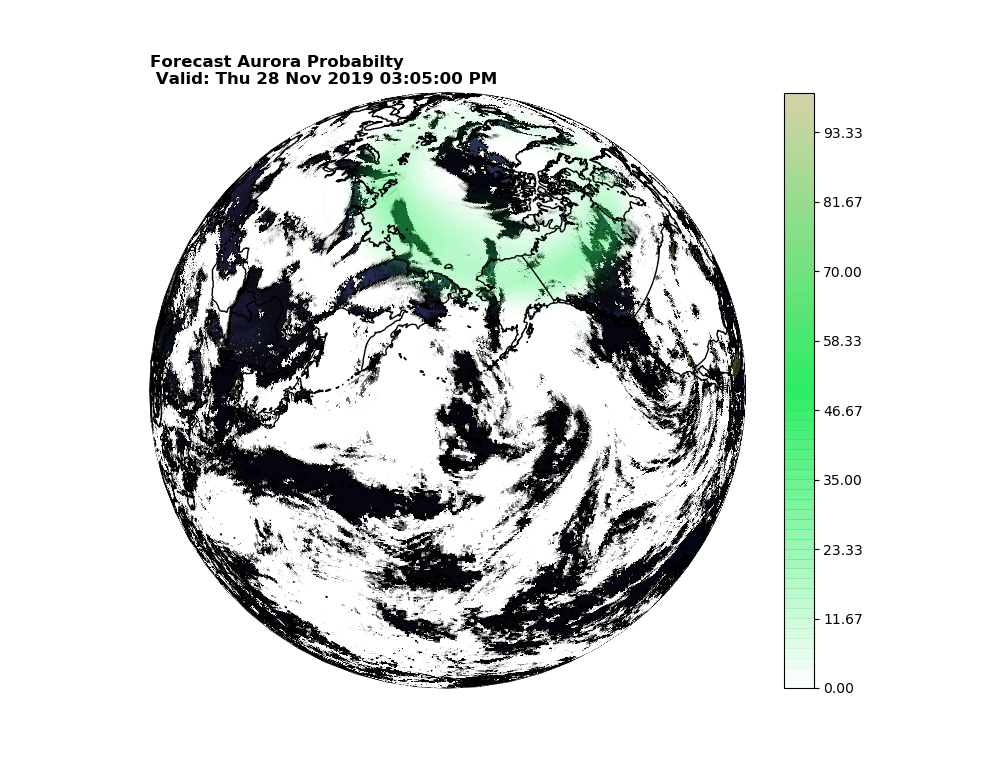
Final Product

Final Notes

That is all for this tutorial, it was a long one, but I think there is a lot of useful stuff in here.  A few final notes, reprojecting the background images can lead to really poor quality images, I find this particularly true for Lambert and PolarStereo projections, so be aware of that. 

Python | Tutorial: Intro to Cartopy

Introduction:

There are currently two main Python libraries for plotting geographic data on map: Cartopy and Basemap.  New users should use the Cartopy since support Cartopy will replace Basemap and support for Basemap is expected to wrap up in 2020.  Therefore, this tutorial will focus on Cartopy.  If you want to use Basemap (e.g., for plotting in "3D"), here are a couple of links to existing tutorials and examples to help get you started.  Furthermore, many concepts described here may be useful for understanding Basemap.

Cartopy:

Cartopy is a geospatial plotting library built on top of Numpy and Matplotlib that makes plotting gridded data, shapefiles, and other geographic data on over 30 different map projections.  Furthermore, the Cartopy "transform" functionality makes it straightforward to convert data from one projection to another.  In this tutorial you will learn how to use Cartopy to:
  • Plot GFS surface temperature data on a map
  • Mask out land surfaces to plot a map of sea surface temperature and ice-cover from the GFS
  • Plot a regional map of surface temperature with US states
  • Use the transform function to plot GFS data on a different map projection

This tutorial accesses the NOMADS data server using the netCDF4 library, if you are unfamiliar with doing this, I recommend you see my tutorial on reading NetCDF data.


Getting Started - Grabbing GFS Data:
The following code is used to get started with this tutorial, essentially, it imports all of the required modules, pulls the GFS data from the NOMADS data server, and loads it into arrays.  Once the data is loaded, the remainder of the tutorial will focus on Cartopy. 

import numpy as np
from matplotlib import pyplot as plt
from cartopy import crs as ccrs
import cartopy.feature as cfeature
import netCDF4 as nc
import datetime as DT 
datetime=(DT.datetime.utcnow()-DT.timedelta(hours=6)).strftime('%Y%m%d')
fhour=20

nomads_path="https://nomads.ncep.noaa.gov:9090/dods/gfs_0p25/gfs{}/gfs_0p25_00z".format(datetime)

datafile=nc.Dataset(nomads_path)
lat=datafile.variables['lat'][:]
lon=datafile.variables['lon'][:] 
sfcT=datafile.variables['tmpsfc'] #Keep meta data for now!
sfcT_data=sfcT[fhour,:]

title=sfcT.long_name
time=datafile.variables['time']
tstart=DT.datetime.strptime(time.minimum,'%Hz%d%b%Y')
timestr=(tstart+DT.timedelta(hours=time.resolution*24.*fhour)).strftime('%c')

Now that your data is loaded, we initialize a figure, and subplot using matplotlibs "projection" keyword to link to the Cartopy library.  Once you've attached the Cartopy package to your subplot, there are a number of additional objects and classes you can add to your figure.  In the first example, I'll demonstrate by calling upon the "coastlines" attribute to plot continents on the map.

fig=plt.figure(figsize=(11,5))
ax=plt.subplot(111,projection=ccrs.PlateCarree())

Now, your figure and subplot are defined.  The Cartopy "PlateCarree()" projection is a basic cylindrical map projection that accepts coordinate information in the form of lat/lon coordinate pairs.  The lat/lon data can be either 1D or 2D, but essentially, if your coordinate information is lat/lon, your projection is PlateCarree().   You can pass 2 keywords into PlateCarree (central_longitude and globe), but in most instances, you won't need to.   Occasionally, I reset the central_longitude to 180, instead of it's default zero.

The code to plot the map is:
Z=plt.pcolormesh(lon,lat,sfcT_data,cmap='jet')

pos=ax.get_position()

plt.title(title,fontweight='bold',loc='left')
plt.title("Valid:{} UTC".format(timestr),loc='right')
ax.coastlines()

cbar_ax=fig.add_axes([pos.x1+0.01,pos.y0,0.015,pos.height])
cbar=plt.colorbar(Z,cax=cbar_ax)
cbar.set_label(title)

datafile.close()

plt.show()

And you'll get an image similar to this one:
GFS surface temperature from Cartopy

Now, lets say you wanted to mask out land areas, and add sea-ice to the map, to focus on the oceans.
Adding the sea-ice is easy, all it requires is for you to pull the icecsfc variable from the GFS data, and plot it overtop of the surface temperature map:

plt.pcolormesh(lon,lat,np.ma.masked_less(ice,0.1),vmin=0,vmax=1,cmap='Greys_r',zorder=3)

We use the numpy mask (ma) functionality to maskout gridcells where the ice cover is less than 10%.
To mask out land areas, we make use of the "Cartopy Feature" module, which handles shapefiles.  The Cartopy Feature module connects seemlessly to the Natural Earth Dataset, and allows for anyone to plot a host of different GIS datasets without needing to download individual shapefiles before hand.  The interface even has many pre-defined functions, including land.  This makes masking out the land areas, a breeze.

ax.add_feature(cfeature.LAND,zorder=4,color='gray')

In the above code, the "add_feature" function is used, and the pre-defined "LAND" feature from the Cartopy Feature package is supplied with a couple of basic keyword arguments.  Putting it all together:


fig=plt.figure(figsize=(11,5))
ax=plt.subplot(111,projection=ccrs.PlateCarree())
Z=plt.pcolormesh(lon,lat,sfcT_data-273.15,cmap='jet',vmin=-1,vmax=30.)
plt.pcolormesh(lon,lat,np.ma.masked_less(ice,0.1),vmin=0,vmax=1,cmap='Greys_r',zorder=3)
ax.add_feature(cfeature.LAND,zorder=4,color='gray')
pos=ax.get_position()

plt.title(title,fontweight='bold',loc='left')
plt.title("Valid:{} UTC".format(timestr),loc='right')
ax.coastlines(color='k',zorder=5)

cbar_ax=fig.add_axes([pos.x1+0.01,pos.y0,0.015,pos.height])
cbar=plt.colorbar(Z,cax=cbar_ax)
cbar.set_label(title)

datafile.close()

plt.show()

Running the above code will give you an image like this:
GFS SST and Sea-ice cover


Now, lets zoom in over the United States, and add states to the map.  To clip the extent, the "set_extent" function is used:

ax.set_extent([-125, -65, 25, 55],crs=ccrs.PlateCarree())

The list corresponds to lon/lat boundaries from [western-most longitude, eastern-most longitude, southern-most latitude, northern-most latitude] and the crs argument indicates which transform is being applied.  To add the states, you need to define the states from Natural Earth database. the "scale" argument

states = cfeature.NaturalEarthFeature(category='cultural', scale='50m', facecolor='none',
                         name='admin_1_states_provinces_shp',edgecolor='k')

 By changing the extent, and adding the states, you'll get a map that looks like this:

GFS SST centered over the United States


You'll notice that the "LAND" feature masks out the Great Lakes, which is unfortunate, and to my knowledge the only way to get both the land mask and the SST over lakes using GFS surface temperature data, is to use a Lakes shapefile with shapefile clipping, a technique that is beyond this simple introduction, but may be the subject of a future tutorial.

Finally, if you want to use a different map projection to plot the data, e.g., a North Polar Sterographic projection, you simply define a different projection when setting up your subplot, and use the "transform" keyword in the plotting function to specify that you are transforming your lon/lat coordinates from the PlateCarree() projection:

ax=plt.subplot(111,projection=ccrs.NorthPolarStereo())
Z=plt.pcolormesh(lon,lat,sfcT_data-273.15,cmap='jet',vmin=-1,vmax=30.,transform=ccrs.PlateCarree())
plt.pcolormesh(lon,lat,np.ma.masked_less(ice,0.1),vmin=0,vmax=1,cmap='Greys_r',zorder=3,transform=ccrs.PlateCarree())
ax.set_extent([-180, 180, 45, 90],crs=ccrs.PlateCarree()) 

Note, that we also reset the extent to focus on the Northern Latitudes.  You should get something that looks like this:
GFS Sea-ice and SST Polar Plot

That is the extent of this introductory tutorial on how to use Cartopy to work with atmospheric data.  You can learn more from the Cartopy Website, and get a list of different map projections here Cartopy Map Projections. Future tutorials on Cartopy will focus on working with shapefiles, transforming individual points, how to work with data without lat/lon coordinates, and how to put fine details on your map.

Thursday, February 19, 2015

Tutorial: Use basemap.gs to make a beautiful map of "SST", Sea Ice and Snow in GrADS

This tutorial will draw upon many of the skills discussed in several other tutorials on this site, e.g., how to handle multiple files at once, or how to use basemap.gs.  There isn't too much "new" information in this tutorial on how to use these different features and functions of GrADS, rather this tutorial will show you how to specifically make a very pretty map of sea-surface temperature, sea ice, and snow.  The final outcome is shown below.

For this tutorial you will need:

Snow Cover and Sea Ice on the Robinson Map Projection


So before we start, I want to give a full disclaimer: The plot is not actually showing any observed SST.  In this tutorial I'm going to use the 0.25 degree GFS surface temperature.  In practice the surface temperature should be roughly equal to the SST over the Oceans.

The first thing we need to do is open both the GFS data and the sea ice data.  This data will come from NOMADS and will be opened using the 'sdfopen' command.  Note, the files below are for February 2015, so keep in mind, that you will need to change the date on files if you wish to copy paste the example code below.


   'reinit'

   gfsfile='http://nomads.ncep.noaa.gov:9090/dods/gfs_0p25/gfs20150218/gfs_0p25_18z'
   icefile='http://nomads.ncep.noaa.gov:9090/dods/ice/ice20150218/ice.00z'

  'sdfopen 'gfsfile
  'sdfopen 'icefile


Now that the files are open we will simply set up the map.  Since we are using the Robinson Projection, we need to set the longitude to range from -180 to 180 and the latitude -90 to 90.  

   'set gxout shaded'
   'set mpdset hires'
   'set lon -180 180'
   'set lat -90 90'
   'set mproj robinson'
   'colormaps -l 272 307 0.5 -map jet' ;*Note the use of colormaps.gs


Then we display the variable:

   'd tmpsfc'
   'xcbar -fs 4'

  
After a moment, the surface temperature will be displayed following the "jet" color map.
Now, we are going to mask out the land using the land basemap from basemap.gs.

Note, in my version of basemap.gs, I did not want to include the frame around the map projection.  So I opened up basemap.gs and commented out the lines at the bottom that draw the rectangle:

   * Draw a new square frame around the plot
   * If you have 'set frame off' or 'set frame circle' before running basemap,
   * you may want to comment out the next 2 lines
   *'set line 1 1 6'
   *'draw rec 'x1' 'y1' 'x2' 'y2


We are going to use the "medium (M)" resolution option for the coastlines, and we are going to define a custom dark gray color for the land.

   'set rgb 73 80 80 80'
   'basemap L 73 0 M'         ;*L = Land, 73 = Fill Color, 0 = outline Color, M=Medium resolution


SST only!
  This will fill in the land areas with a gray map and you will have an image like this:

Now that we are done with the "SST" and the land mask, we are going to open up the sea-ice file and plot the sea ice.  It is important that you use the maskout function when plotting the sea-ice, otherwise you will overwrite all of the SST data with zeros.

  'set gxout shaded'
  'set dfile 2'                   ;*Sets Default file to file 2 (Sea ice)
  'set z 1'                        ;*Set z to 1
  'set t 1'                        ;*Set t to 1
  'set map 0 1 6'   
  'color 0 0.6 0.1 -kind dimgray->seashell->white'           ;*Note use of color.gs
  'd maskout(icecmsl,icecmsl-0.1)'                                     ;*Need to mask out ice.


After a few moments, the sea ice will plot and you will have an image like this:

Sea Ice and SST only!


Now this is all well and good, but our knowledge is limited to the ice over the oceans, we don't really get any sense of how ice and snow covers the land masses.  So the final touch that we'll add to the map is to plot the GFS snow water equivalent (SWE) using a similar color scale as ice cover.  To do that, we need to reset the file to our first file and then reset our time our vertical level.  Lastly, we plot SWE (again using maskout to avoid plotting over everything).

  'set dfile 1'
  'color 10 100 5 -kind dimgray->seashell->white'
  'set z 1'
  'set t 1'
  'set map 0 1 6'
  'd maskout(weasdsfc,weasdsfc-10)'


And after a few moments, you have a map like the one shown at the beginning of the tutorial.
You can play around with your minimum values for ice and snow, I used 0.1 for sea-ice and 10 mm for SWE.  That seemed to produce a good looking map.  Experiment as you like!  This plot is really basic, no special formatting outside of the actual plot (titles, etc).  Hopefully you enjoyed this tutorial, I know it was oddly specific, and didn't really present anything new, hopefully you learned something anyway!

Download Example Script


Monday, May 13, 2013

A look at the different map projections in GrADS

There are a number of different possible map projections you can use in GrADS, and you may be familiar with some, or all of them, or perhaps you are only familiar with the standard default lat/lon projection used.  This entry will be less of a tutorial and more of just a detailed look at the different map projections you can use in GrADS.  However, before we get started, we do need a little tutorial section, just so you know the syntax for setting the map projection.  Setting the map project is extremely simple: Use the 'set mproj' command and provide it with a map projection from the list below:

1: latlon      Lat/lon projection with aspect ratio maintained (default)
2: scaled      Lat/lon aspect ratio is not maintained; plot fills entire plotting area
3: nps         North polar stereographic
4: sps         South polar stereographic
5: lambert     Lambert conformal conic projection
6: mollweide   Mollweide projection
7: orthogr     Orthographic projection
8: robinson    Robinson projection, requires set lon -180 180, set lat -90 90
9: off         No map is drawn; axis labels are not interpreted as lat/lon


Example:
    'set mproj nps'

That's all there is to it.  Once you have set your projection, you set the lat/lon boundaries as you normally would using the default settings, although certain map projections have intrinsic limits associated with them, which we will explore here.  So, in order to make the examples shown below, we will very simply plot vorticity from the GFS on a bunch of different map projections.  So starting out with the following code we will get this basic image, on the default cylindrical map projection,

    'sdfopen http://nomads.ncep.noaa.gov:9090/dods/gfs_hd/gfs_hd20130513/gfs_hd_00z'
    'set gxout shaded'
    'set lev 600'
    'set mpdset hires'
    'd abs(absvprs)'


Vorticity on a Defualt latlon map projection

So, now that we have that out of the way, lets look at the other map projections.

Scaled:

The scaled map projection does not differ much from the default cylindrical projection, except that it gets rid of the aspect ratio.  Basically, using this option will squish, or elongate the map to fit your specified page area.  The image below shows the transition.  To show the different more dramatically, I set the lat/lon coordinates to -40 to 40 instead of -90 to 90.

latlon vs. scaled map projections

Personally, I don't have much use for the "scaled" map projection, but it is always an option if you need to fit stuff together.

North/South Polar Stereographic NPS/SPS:

The NPS map projection can be useful if you are looking down at the north pole.  Pretend basically that you have the northern hemisphere, and you flatten it.  This would be the north polar stereographic projection.  For the southern hemisphere, simply take the same concept and apply it.  Now, while this map projection does not set latitude boundaries, my rule of thumb has been to set the minimum(maximum, depending on your hemisphere) latitude to be the equator.  I have trouble getting information if I look at southern hemisphere values using an nps projection.  The example below shows each full hemisphere using each projection.  Latitude set from 0 to 90 and -90 to 0.

NPS vs. SPS

Now, you don't need to have longitude set to cover the entire globe either, or the entire hemisphere.

Lambert:

The best way to think about the Lambert map projection is as if the Earth was projected onto a cone.  In fact, often time this projection is referred to as a "conic" projection as well.  Anyway, imagine the Earth is projected onto a cone with the north pole at it's point.  The Lambert projection is basically what the map would look like if the projection was unwrapped and then flattened.  The Lambert projection requires, that your latitude boundaries exist in the same hemisphere, otherwise the projection won't work.  The below example, shows the Lambert projection applied to the northern hemisphere for the longitude coordinates from -180 to 0 (western hemisphere)

Lambert Projection


Mollweide:

The Mollweide projection is often used to show global maps, but in GrADS there are no specific requirements for the latitude/longitude boundaries.  This projection can be neat, as it sort or combines a spherical look with a cylindrical look, with the meridians converging at the pole.  This gives a neat almost 3D appearance.

Mollweide projection

Orthographic Projection:

The orthographic projection is another neat projection that gives a 3D spherical appearance.  In GrADS there are strict requirements for the orthographic projection.  Your latitude boundaries must span -90 to 90.  Additionally, your longitude coordinates must span 180 degrees, no more, no less.  You have the option of choosing your longitude boundaries, so long as they cover 180 degrees of territory.  The result is an image similar to this one.


Orthographic projection


Robinson Projection:

The last map projection I am going to discuss is the "Robinson" Projection (The "off" projection is not really interesting, so I'm not going to talk about it) The Robinson projection is similar to the Mollweide projection, but with the poles kind of flattened out.  This is another commonly used map projection.  In GrADS this projection requires that lat/lon boundaries cover the entire globe.  Lat=-90 to 90, and Lon=-180 to 180 (0 to 360).


Robinson projection

So that's it for the different map projections in GrADS.  As always, each projection is useful depending on the situation, the map, the variable plotted, etc., etc.  I hope this post has given you a little more information regarding each different type of projection.  Just remember that some of them require specific lat/lon boundaries.  Aside from that, picking the right projection is just a matter of trial and error.