This script not only makes it possible, but easy to plot 2D scatter or line plots in GrADS using user specified arrays. That is, there is no requirement than an outside file be open, and the 'display' command is not needed or used. Now, for most things, it is probably easier to use matlab, python, idl or even excel to do graphs like these. However, I can certainly see the advantages of this script if you are accessing large data sets right through the NOMADS data server, or the GrADS data server.
Example usage:
xarray='1 2 3 4 5 6 7 8 9 10'
yarray='1 2 3 4 5 6 7 8 9 10'
'scatter -x 'xarray' -y 'yarray
Depending on the options used, your plot will look similar to the one below.
Note: you must include both the -x and -y to specify your arrays, and your arrays must take a form similar to the ones listed above.
There are numerous options to customize your plot, they are listed in the script under "default options at the top." Additionally, most of these options can be set manually when calling the function.
To find out more about these options, use the help page associated with the script:
'scatter -help'
The main example I will show here, is basically, taking the time-series surface temperature and the surface RH at a given point, and then making a scatter plot of the two variables.
As always, we will start by opening the file:
'sdfopen http://nomads.ncep.noaa.gov:9090/dods/gfs_hd/gfs_hd20130715/gfs_hd_00z'
Once the file is open, we clear the screen and pick a point and then set gxout to print, since are are just going to populate our arrays with numbers.
'clear'
'set lat 40'
'set lon -90'
'set gxout print'
Now, we need to start populating our arrays! This isn't too hard we just set our initial arrays = '' (blank), and then loop through all time steps (65 for GFS) and concatenate as we go, being sure to leave a space between each new array variable.
t=1
xarray=''
yarray=''
while(t<=65)
'set t 't
'd tmp2m'
tmp=sublin(result,2)
tmp=subwrd(tmp,1)-273
xarray=xarray' 'tmp
'd rh2m'
tmp1=sublin(result,2)
tmp1=subwrd(tmp1,1
yarray=yarray' 'tmp1
t=t+1
endwhile
Now, we have our arrays, so all we need to do is call scatter...
'scatter -x 'xarray' -y 'yarray' -xmin 15 -ymin 50 -ymax 100 -xmax 35 -xpg 1.5 9.5 -ypg 1 7.4 -box'
So, as you can probably see, this call uses several of the options available in the script.
-xmin: Manually sets minimum x-axis value
-ymin: Manually sets minimum y-axis value
-xmax: Manually sets maximum x-axis value
-ymax: Manually sets maximum y-axis value
-xpg: Sets page limits in x
-ypg: Sets page limits in y
-box: Draws box around plot, instead of two axis as shown in Fig.1.
This will plot something similar to the plot below. You will be prompted in the script to place the equation, and type in the titles (unless you have default titles set).
This plot appears more or less as you might expect, RH is inversely proportional to temperature (Think Clausius), and while this relationship isn't physically linear, you still get a decent correlation here.
Remember, You will be prompted to place the equation and your titles, so be sure to read the console as you work with this script!
Lastly, there are several options that exert varying degrees of control over your plot (just a few are listed above), including number of ticks on each axis, font/symbol/line color and style, labels, etc., etc., So be sure to bring up the help page to get an idea of how to set different options. Most of the time, this type of analysis is best left to matlab, or something, if you are used to GrADS, this might cut out having to save data to an outside file just to do this. Who knows, hopefully you all find it useful!
Remember, this is version 1.0, so bugs are certainly possible, if not likely, please report them here!
Download Scatter.gs
Download example script
Example usage:
xarray='1 2 3 4 5 6 7 8 9 10'
yarray='1 2 3 4 5 6 7 8 9 10'
'scatter -x 'xarray' -y 'yarray
Depending on the options used, your plot will look similar to the one below.
 |
| Fig.1: Example Scatter Plot, With regression line and equation |
Note: you must include both the -x and -y to specify your arrays, and your arrays must take a form similar to the ones listed above.
There are numerous options to customize your plot, they are listed in the script under "default options at the top." Additionally, most of these options can be set manually when calling the function.
To find out more about these options, use the help page associated with the script:
'scatter -help'
The main example I will show here, is basically, taking the time-series surface temperature and the surface RH at a given point, and then making a scatter plot of the two variables.
As always, we will start by opening the file:
'sdfopen http://nomads.ncep.noaa.gov:9090/dods/gfs_hd/gfs_hd20130715/gfs_hd_00z'
Once the file is open, we clear the screen and pick a point and then set gxout to print, since are are just going to populate our arrays with numbers.
'clear'
'set lat 40'
'set lon -90'
'set gxout print'
Now, we need to start populating our arrays! This isn't too hard we just set our initial arrays = '' (blank), and then loop through all time steps (65 for GFS) and concatenate as we go, being sure to leave a space between each new array variable.
t=1
xarray=''
yarray=''
while(t<=65)
'set t 't
'd tmp2m'
tmp=sublin(result,2)
tmp=subwrd(tmp,1)-273
xarray=xarray' 'tmp
'd rh2m'
tmp1=sublin(result,2)
tmp1=subwrd(tmp1,1
yarray=yarray' 'tmp1
t=t+1
endwhile
Now, we have our arrays, so all we need to do is call scatter...
'scatter -x 'xarray' -y 'yarray' -xmin 15 -ymin 50 -ymax 100 -xmax 35 -xpg 1.5 9.5 -ypg 1 7.4 -box'
So, as you can probably see, this call uses several of the options available in the script.
-xmin: Manually sets minimum x-axis value
-ymin: Manually sets minimum y-axis value
-xmax: Manually sets maximum x-axis value
-ymax: Manually sets maximum y-axis value
-xpg: Sets page limits in x
-ypg: Sets page limits in y
-box: Draws box around plot, instead of two axis as shown in Fig.1.
This will plot something similar to the plot below. You will be prompted in the script to place the equation, and type in the titles (unless you have default titles set).
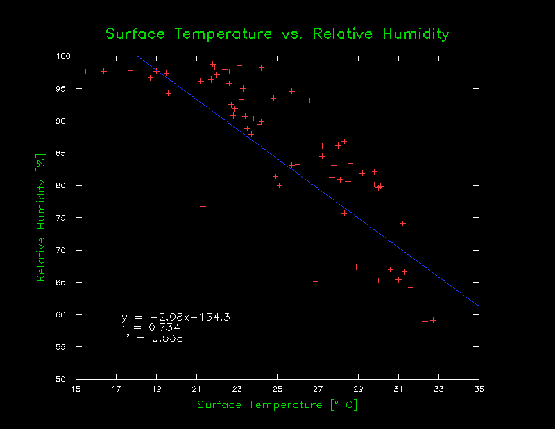 |
| Fig.2: Surface Temp vs Relative Humidity, with regression shown |
Remember, You will be prompted to place the equation and your titles, so be sure to read the console as you work with this script!
Lastly, there are several options that exert varying degrees of control over your plot (just a few are listed above), including number of ticks on each axis, font/symbol/line color and style, labels, etc., etc., So be sure to bring up the help page to get an idea of how to set different options. Most of the time, this type of analysis is best left to matlab, or something, if you are used to GrADS, this might cut out having to save data to an outside file just to do this. Who knows, hopefully you all find it useful!
Remember, this is version 1.0, so bugs are certainly possible, if not likely, please report them here!
Download Scatter.gs
Download example script


